Attention
This documentation refers to the single-user TOAST-legacy version which is being phased out!
Consult https://docs.gempa.de/toast-client/current/ for the online documentation of the new TOAST multi-user version.
Graphical User Interface
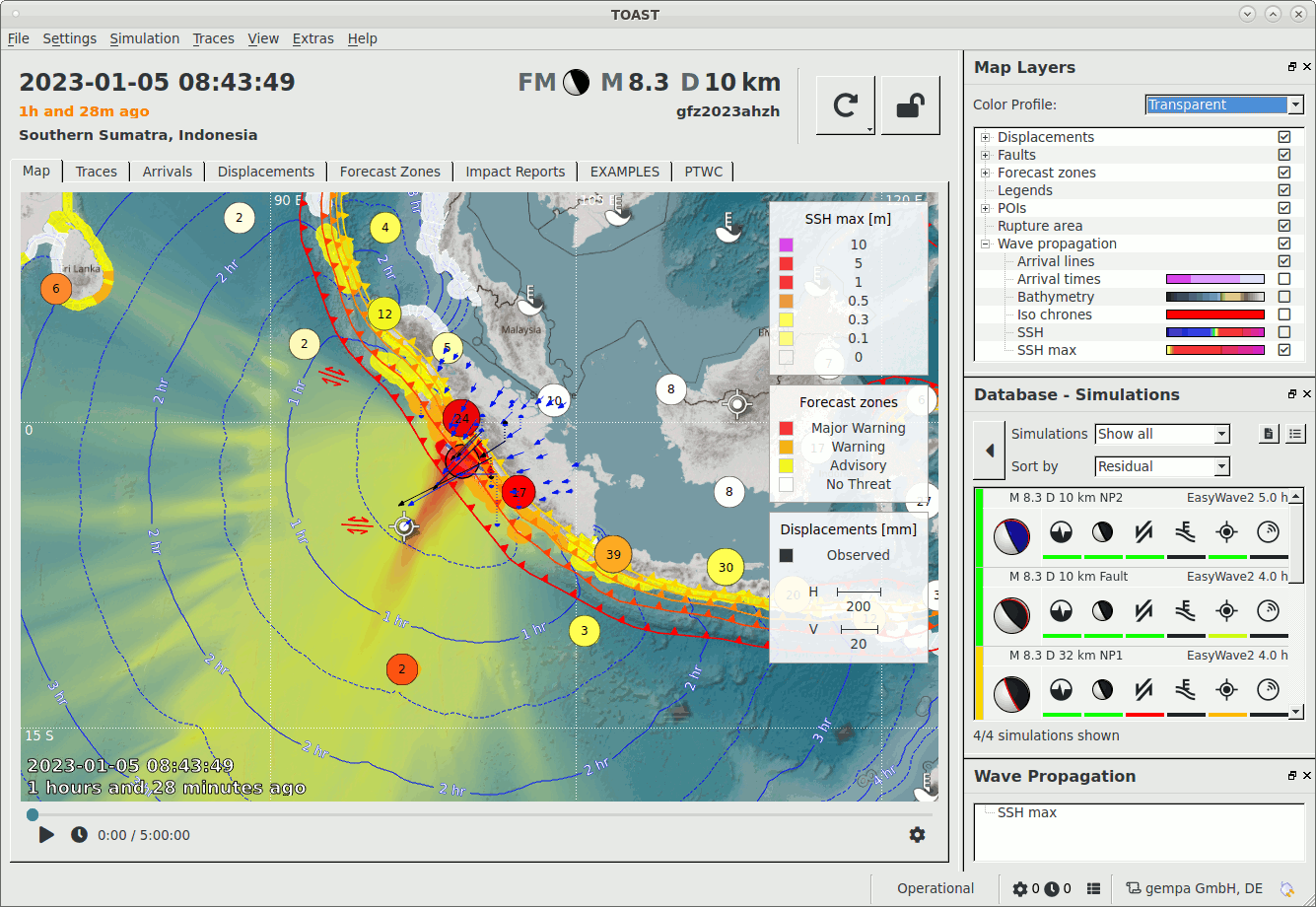
TOAST user interface
Map perspective shows maximum wave height, arrival lines and warning levels.

Real-time waveforms provide instantaneous sea-level information.
Arrivals perspective shows tsunami metrics computed on simulations and manual picks.
Forecast zones perspective shows the local threat levels in tabular form.
Overview
The TOAST user interface consists of one large main panel with several tabs and three smaller panels.
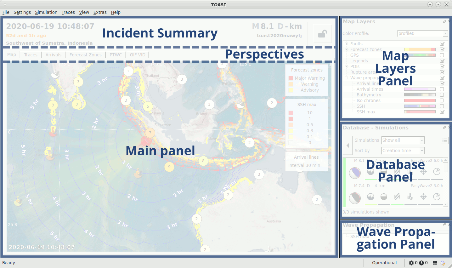
TOAST user interface panels
The tabs in the main panel offer following perspectives:

The first six are always present. The others are configurable Live Tabs which are used to create, view and disseminate bulletins. They are set up as described in: Live Tabs configuration.
On the right side (by default), there are three smaller panels:
Hint
The various perspective tabs in the main panel and the Map Layers-, Database- and Wave Propagation panels can be undocked and moved to an other position or even different screen using drag and drop with the left mouse button. Upon closing, the perspectives get reinserted in the main window. The three small panels can be switched on or off using .
Incidents are the primary objects in TOAST. They can contain a SeisComP event reference and zero or multiple simulations. In case simulations are present, they can be set active using the database panel. In the Map layers panel they can be switched on and off for display in the Map perspective and the Wave Propagation panel.
SeisComP events are received through the messaging system and - depending on configuration settings - can automatically trigger the creation of new incidents and simulations. New incidents and simulations can also be generated manually by user interaction. See also: toast_importing_creating and toast_simulations.
The Map perspective shows the location of the tide gauges as well as information related to active incidents and simulations, like maximum wave height and forecast zones warning levels.
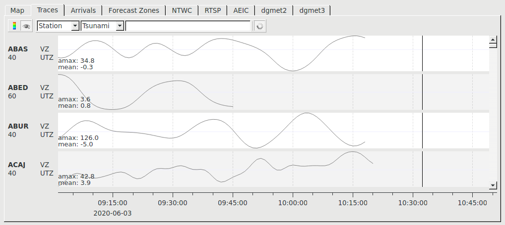
Real-time data from the configured tide gauge stations is shown in the Traces perspective.
In the Arrivals perspective, tsunami metrics at the tide gauges for real data as well as simulations are listed. The Waveform picker is used to manually pick tsunami arrivals, amplitudes and periods on observed tide gauge time series (black line). Traces corresponding to active simulations are shown in the same color throughout all perspectives. Observed and simulated data can be compared here.
The Forecast Zones perspective is used to assess the warning levels at the defined coastal sections.
Test mode
TOAST has a test mode which can be toggled on and off using CTRL+T or by: . If enabled, a thick orange bar is drawn around the TOAST user interface. In test mode, bulletins can not be disseminated, unless their configured templates explicitly allow it.
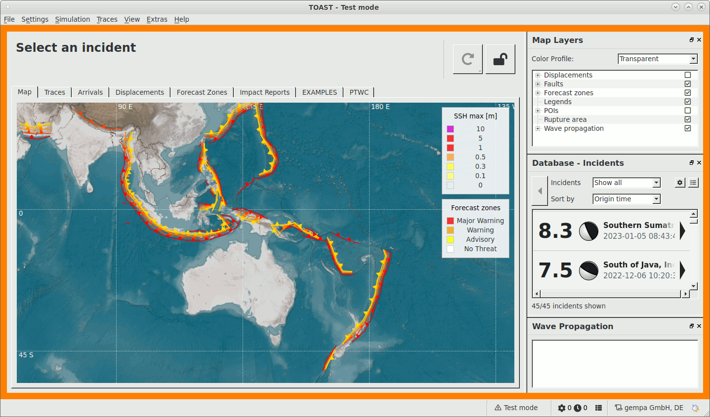
TOAST test mode
Hotkeys
Following hotkeys are available in all perspectives.
Action |
Description |
|---|---|
F2 |
Open connection setup dialog |
F3 |
Hide legend |
F4 |
Open ‘Import SeisComP event’ dialog |
F7 |
Open task manager |
F8 |
Open system log |
F11 |
Toggle full screen |
CTRL+G |
Open Gradients and colors editor |
CTRL+H |
Open Displacement settings dialog |
CTRL+P |
Open Gradients profile editor |
CTRL+T |
Toggle test mode |
Main panel
Incident Summary
The top of the main panel contains the Incident Summary, which shows some information on the active Incident, namely:
Origin time
Time ago
Region
Focal mechanism (if available)
Preferred magnitude
ID
See Database panel and toast_importing_creating on how to select or import incidents.

Incident Summary
If the lock button on the right side is pushed, the current incident remains active if the creation of new incidents is triggered by the messaging system.
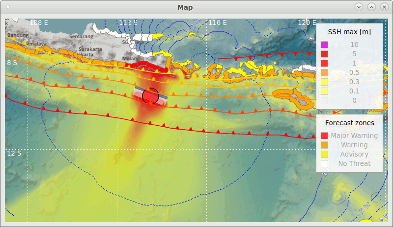
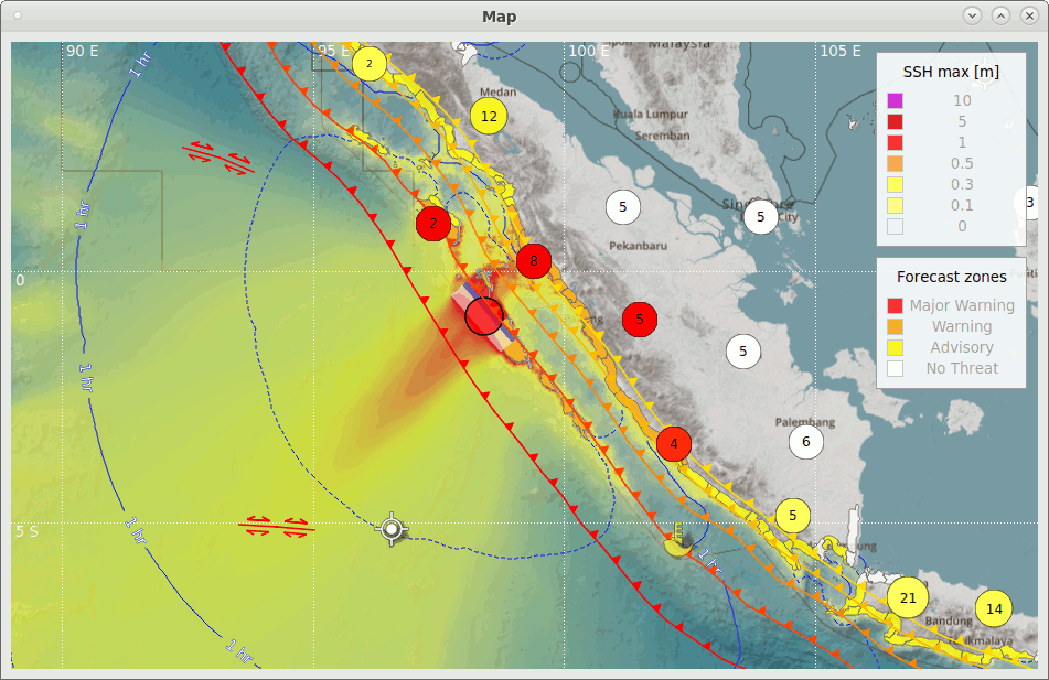
Map perspective
The Map tab presents an overview of the current situation. It displays the tide gauge stations (either clustered or not), the configured tectonic faults and the location of the active incident. By right mouse click on the map several options can be configured.
Map perspective
If one or more simulations are active, the map can also display results related to the simulation(s), like arrival times, predicted wave height, warning levels for the forecast zones and others. Which features are to be shown can be selected in the Map Layers panel.
The handling of the Map perspective is similar as in SeisComP. For instance, to locate a station on the map, press CTRL+F, enter or select a station ID from the list and click the find button. With CTRL+mouse click distances and directions can be measured. By clicking on a station or a forecast zone, it is selected in the Arrivals- or the Forecast Zones perspective as well. With SPACE+mouse click the tables are additionally scrolled to the selection. This works as well the other way around: SPACE+mouse click in the Arrivals or Forecast Zones perspective centers the object on the map.
Simulation player
Upon moving the mouse to the lower edge of the map, the simulation player bar is shown, see figure TOAST simulation player. For instance, if SSH max is selected in the Map Layers panel, it can be used to illustrate the propagation of the tsunami wave for active simulations in real- or accelerated time.
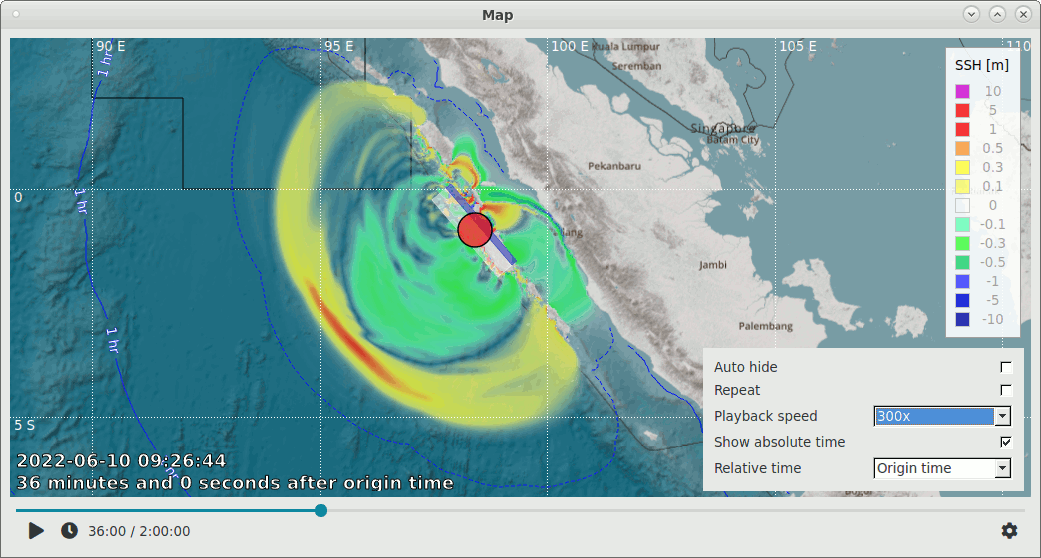
TOAST simulation player
The triangle icon starts the playback, the watch icon jumps to current time before starting playback. Using the settings icon on the right you can select among other things whether to display absolute time (that is, simulation time corresponding to player position) in the lower left of the map. You can also display relative time either with respect to origin time or current time.
Hotkeys
Following additional hotkeys are available in Map perspective.
Action |
Description |
|---|---|
CTRL+F |
Show station search |
Arrows |
Move map |
Mouse wheel |
Zoom |
Double click |
Center map |
Pan |
Move map |
Middle mouse button |
Create artificial incident |
Mouse click on POI (tide gauge or GNSS station) |
Select (also in Arrivals perspective) |
Mouse click on forecast zone |
Select (also in Forecast Zones perspective) |
SPACE+mouse click on POI or zone |
Additionally scroll to selection in other perspectives |
Traces perspective
The Traces tab displays the observed water levels at the tide gauge stations in real time.
Traces perspective
The labels on the left are:
Network code
Station code
Location code
Channel code
In addition to the stream information, the offset (mean) and the difference
between the offset and the maximum wave height (amax) are displayed.
The number of shown decimals can be configured via the option
scheme.precision.traceValues.
The toolbar of the Traces perspective provides the following functions:
Enable computation of spectrograms (color bar symbol)
Show/hide spectrograms (eye symbol) and select mode (long click)
Sort by (Network / Station)
Tide gauge time series filter
Stream selection filter (e.g. VZ.* or *.A*)
Start/stop real time acquisition (green arrow / circle)
A tide gauge time series filter can be applied using the filter drop-down menu.
The current filter affects all traces. To change the available filters use:
scconfig
to set rttv.seaLevel.filters. New filters may be added temporarily
by drag and dropping a filter on a trace.
The button with the green arrow starts/stops the data acquisition. A progress
indicator is shown if the acquisition is running. To start the acquisition
automatically use the configuration option rttv.acquireStreams.
Spectrogram
The spectrogram can be seen as a sequence of spectra in time where the frequency axis is vertically arranged and the amplitude is color-coded.
Note
The spectrogram is computed using an Infinite Impulse Response Filter, which allows it to be shown in real-time. Note that due to the low sampling rate of tide gauge data, a delay of about 30 minutes may appear. This is still less than if using a Fast Fourier Transform algorithm.
Enable the computation of the spectrograms using the color bar icon. Activate the display of the spectrograms using the eye icon. The spectrograms can be shown in two different modes which are selected by long mouse click on the eye symbol:
- Local scale
Local scale computes the minimum and maximum of each trace and maps the configured gradient color with value 0 to this minimum and gradient color with value 1 to the maximum.
- Fixed scale
The configured values (
rttv.spectrogram.fixedMinimumandrttv.spectrogram.fixedMaximum) are mapped torttv.spectrogram.gradientvalue 0 and 1. The trace minimum/maximum is ignored.
To configure the frequency or period range per stream, create a TOAST
binding profile using:
scconfig and set spectrogram to either:
periods_log(from, to, ranges, bands) - logarithmic scale
periods(from, to, ranges, bands) - linear scale
freqs_log(from, to, ranges, bands) - logarithmic scale
freqs(from, to, ranges, bands) - linear scale
Then drag and drop the profile to the left either onto a network or station.
Hotkeys
Traces perspective supports following hotkeys.
Action |
Description |
|---|---|
CTRL+Arrows |
Zoom in/out in Time and Amplitude |
Buttons |
Zoom in/out in Time and Amplitude |
Mouse wheel |
Scroll through traces |
Y / SHIFT+Y |
Zoom in/out in Y-scale |
< / > |
Zoom in/out in X-scale |
Pan |
Move in time |
f |
Toggle filter |
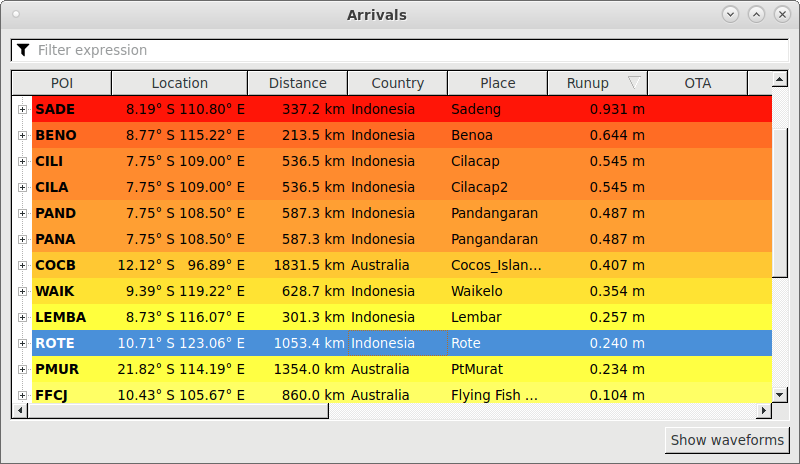
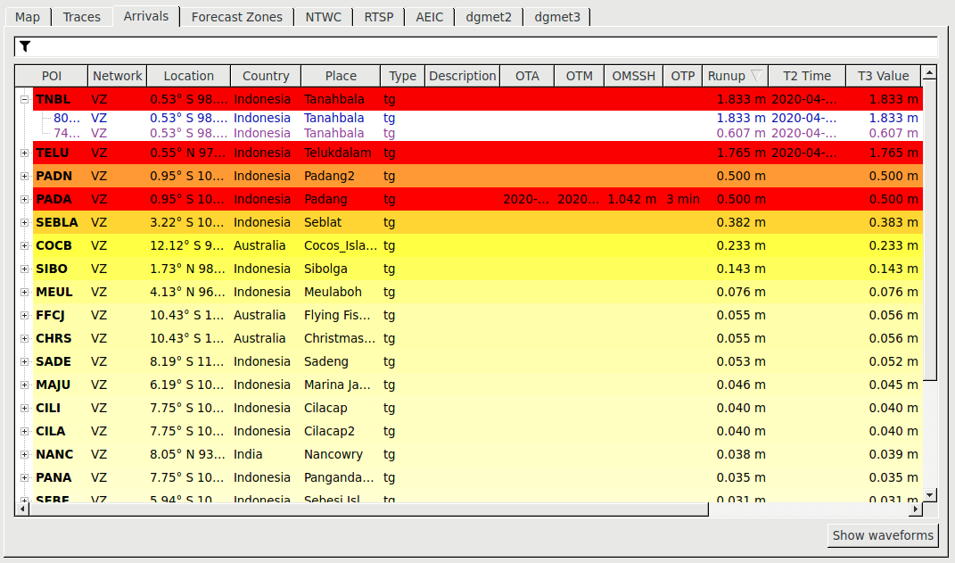
Arrivals perspective
The Arrivals perspective shows tsunami metrics computed on observed data and simulations for tide gauges which fulfill at least one of the following conditions:
At least one simulation is active which affects the tide gauge
A manual pick or an amplitude were set on the observed tide gauge time series using the Waveform picker.
Arrivals perspective
For each tide gauge the following information is displayed in tabular form:
Station code
Network code
Location (Longitude Latitude)
Country
Place
Type
Description
Observations
OTA: Observed time of tsunami arrival
OTM: Observed time of tsunami maximum wave height
OMSSH: Observed tsunami maximum wave height (SSH: Sea Surface Height)
OTP: Observed tsunami period
Simulation results
Runup
T1 Time: Time of exceedance of the detection threshold (see also plugin configuration parameters
easywave2.T1Thresholdandeasywave2.T1Absolute)T2 Time: Time of first exceedance of the threat threshold
T3 Time: Time of maximum positive amplitude
T4 Time: Time of last exceedance of the threat threshold
Tx Value: Wave height at time Tx
Note
Depending on the simulation backend that is used, Runup and T3 Value might slightly differ. In case of EasyWave for instance, T3 Value is extracted from time series while Runup is output directly. If the difference is large, this could be related to Green’s Law, which, depending on configuration, might be active only on Runup. See EasyWave documentation for more details.
Tide gauges are represented as top level rows which can be expanded by clicking on the plus sign. Then the active simulations affecting the tide gauge are shown. The text color of the simulations coincides with the fill color of the active simulations in the database panel and the other perspectives.
The results for different active simulations are aggregated to obtain results for a tide gauge assuming worst case, that means minimum for arrival times and maximum for wave heights.
The background color of a tide gauge reflects the maximum of OMSSH and Runup. The color scheme is based on the selected SSH color gradient.
A filter can be set to display only a subset of the tide gauges in following way: Click the funnel symbol, select the criterion (e.g. Country), and enter a regular expression (e.g. Indo*).
Upon mouse click on a POI it is also selected in the Map perspective. By SPACE+mouse click, it is additionally centered on the map.
Waveform picker
The button Show waveforms at the lower right corner of the Arrivals perspective opens the manual picker and allows picking of tsunami onsets, tsunami amplitudes and tsunami periods on observed tide gauge time series. Values can also be entered manually without using real data for instance for training purposes. If the data source is configured correctly and data are available, the observed tide gauge trace is shown as gray line. If simulations are present and active, corresponding traces are shown in the same color as in the Database panel.
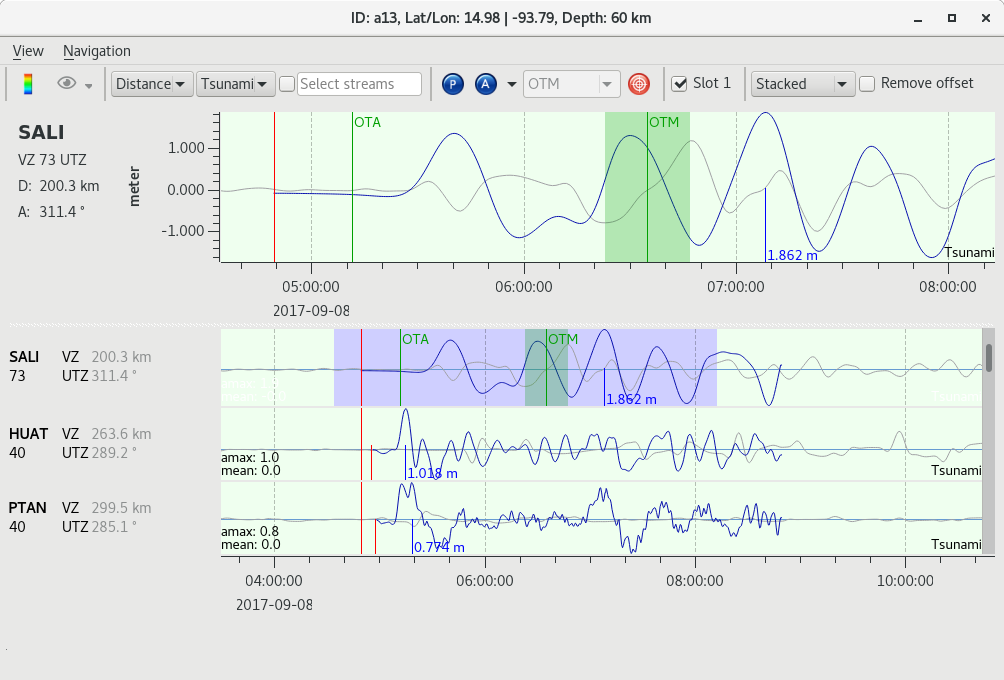
Manual picker
The toolbar of the manual picker provides the following functions:
Compute spectrograms (color bar symbol)
Show/hide spectrograms (eye symbol)
Sort by (e.g. Distance, Network etc.)
Tide gauge time series filter (Raw, Tsunami), indicated on right side of trace
Stream selection filter (e.g. VZ.T* or *.A*)
Phase picking (arrival time) (blue P)
Amplitude and period picking (blue A, on observed stream and manually)
Submit (red button)
Slot
Mode for showing selected time series (drop-down menu)
Remove offset selector
To pick the tsunami onset click on the P-button (Phase), move the mouse to the position where you want to set it and do a left double-click. Observed time of arrival is labeled OTA.
To pick tsunami amplitudes and periods on observed data, use the A-button (Amplitude). First make sure by clicking on the arrow to the right that Artificial wave height is not selected. Using the mouse with left-click-and-drag on the selected trace on top you can now define a time window which should contain the maximum and the nearest minimum. In case the maximum is clipped, try to estimate the time of the maximum and release the mouse button there. A blue selection appears showing where the amplitude processor looks for the maximum and minimum. Once you release the mouse button, a green selection shows the time window between the found maximum and minimum and which is assumed to be half the tsunami period. Observed time of maximum amplitude is labeled OTM.
If no observed data are available, or if you want to manually enter maximum wave height for a tide gauge, select Artificial wave height by clicking on the selection arrow to the right of the A-button, and proceed as described above. Then you have to enter a value manually for the maximum wave height and half-period corresponds to the selected time window.
To apply arrival times or amplitudes, click on the red submit button and the information is shown in the Arrivals perspective and submitted to the TOAST database.
Picked tsunami arrivals (green vertical line labeled OTA) can be compared to simulated arrivals (small red vertical line). The green window and line labeled OTM indicates the picked observed tsunami period, maximum, and corresponding time. The blue vertical line shows the maximum wave height and corresponding time of the selected simulations (worst-case aggregation).
Note
As later waves are often influenced by the local conditions, for example harbor walls and reflections, it is often useful to focus on the first incoming wave of a simulation.
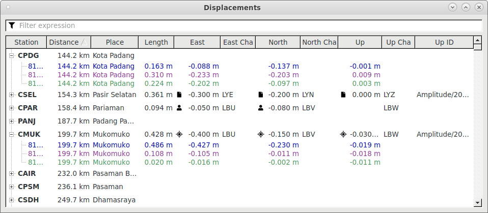
Displacements perspective
The Displacements perspective shows the observed coseismic static displacements (either received automatically by messaging, set manually or imported) as well as computed displacements of the active simulation(s) in tabular form. They correspond to the displacement vectors shown in Map perspective. Both observed and computed displacements are used to compute Displacement residuals to rank simulations.
Displacements and active simulations
For each GNSS station the following information can be displayed (right click on table header to select columns):
Station code
Network code
Location (Lat/Lon)
Distance to epicenter
Country
Place
Station type
Description
Length: total vector length
H Length: horizontal vector length
East displacement
East channel code
East amplitude ID (if available)
North displacement
North channel code
North amplitude ID (if available)
Up displacement
Up channel code
Up amplitude ID (if available)
Manually set displacement values have a user icon, values received automatically by messaging have a GNSS icon and values imported from an XML file have a file icon. See Import displacement amplitudes and create observed displacements for more information.
Displacements can be removed via . It is possible to remove all observed displacements at once by right-clicking on an incident and or via if an incident is active.
By clicking on the plus symbol of a station, the view is expanded to show the active simulation(s) and the simulation results. The text color of the simulations coincides with the fill color of the active simulations in the database panel and in the other perspectives.
Upon mouse click on a station, it is also selected in the Map perspective. By SPACE+mouse click, it is additionally centered on the map.
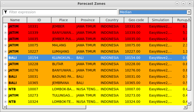
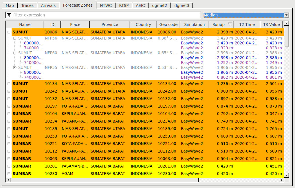
Forecast Zones perspective
The Forecast Zones perspective shows the forecast zones, the corresponding forecast points (or POI) affected by the active simulation(s) and the simulation results for the zones.
Forecast Zones perspective with active simulations
For each forecast zone the following information is displayed in tabular form:
Name
ID
Place
Province
Country
Geo code
Simulation backend
Runup
T1 Time: Time of exceedance of the detection threshold (see also plugin configuration parameters
easywave2.T1Thresholdandeasywave2.T1Absolute)T2 Time: Time of first exceedance of the threat threshold
T3 Time: Time of maximum positive amplitude
T4 Time: Time of last exceedance of the threat threshold
Tx Value: Wave height at time Tx
By clicking on the plus symbol of a forecast zone, the view is expanded to show the POI included in the zone. Clicking on the plus sign of a POI expands to show the currently active simulations for this POI.
The text color of the simulations coincides with the fill color of the active simulations in the database panel and the other perspectives.
The background color corresponds to the Runup value (see also: Note on Runup) and the selected forecast zones color gradient.
A filter can be set to display only a subset of the forecast zones in the following way: Click the funnel symbol, select the criterion (e.g. Province), and enter a regular expression (e.g. WEST*).
Upon mouse click on a forecast zone it is also selected in the Map perspective. By SPACE+mouse click it is additionally centered on the map.
Aggregation strategy
Note
The aggregation over simulations is done assuming worst-case: that means minimum for arrival time and maximum for wave height. The aggregation over POI runup is done using the selected runupPercentiles profile in the drop-down selector. By default this is Median. The definition of percentiles is according to Python numpy convention. You can add and register additional profiles using scconfig .
Manually entering runup for a forecast zone
It is possible to enter or override the runup value on forecast zone level manually. This might be useful for instance if there is no simulation available, or if an observed value is received by an external channel like telephone, or for training purposes. To do so, right-click on a forecast zone, and set . This can be done both in Map and in Forecast Zones perspective. An icon on the left side of the runup column indicates manually entered values.
Configuration
For the setup and configuration of forecast zones, see: Forecast zones configuration.
Impact Reports perspective
The Impact Reports perspective can be used to add, edit and remove text-based observations. They are associated with an incident.
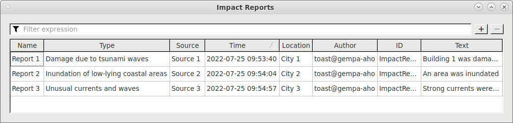
Impact Reports perspective with 3 example reports
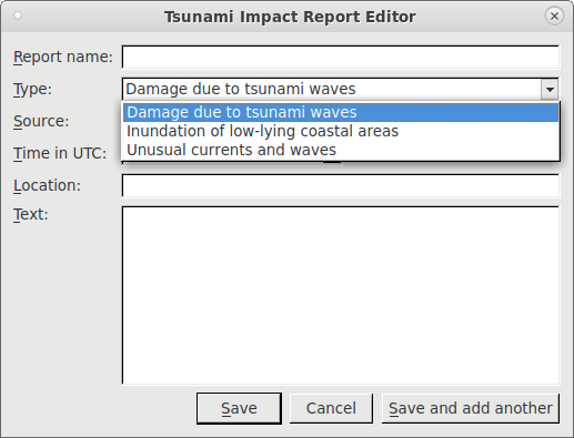
New reports are added by clicking the +-icon, removed by clicking -, and edited via double-click on a report. Report name, Type and Time are mandatory, while Source, Location and Text are optional. Author and ID are generated automatically.
Impact Reports dialog
In the bulletin templates, the impact reports can be iterated over similarly to the forecast zones or points of interest. See the example template: impact_reports.txt.example delivered with TOAST.
The default configuration contains the 3 report types “Damage due to tsunami waves”, “Inundation of low-lying coastal areas”, and “Unusual currents and waves”.
Additional report types can be configured using scconfig by adding
impactReports profiles and registering them using the configuration parameter
impactReports.
Live Tabs
Live tabs offer a very powerful way for the creation and dissemination of bulletins based on templates and simulation results. They are displayed as tabs in the main panel.
Configuration
For the setup, configuration and use of live tabs and templates, see: Create warning bulletins and other output using templates.
Database panel
The database panel has two modes: Incidents mode and Simulations mode. Former is used to import and list currently loaded incidents, while latter shows the simulations (sometimes also called scenarios) available for an incident. The current mode is indicated in the title bar.
Both modes feature an Icons and a Details view which can be activated using the list-icon on the upper right of the panel.
In Incidents mode, by right-clicking on an incident and selecting Open log file… you can open the log file for the respective incident in the system default text editor. To open the incident log viewer click on the Show incident log button in the database panel in Simulations mode or use the Menu or shortcut CTRL+I. For more information see: Incident Log.
Incident mode
Database panel in Incidents mode in Icons view
Import incidents
See: toast_importing_creating.
Quickfilter
In Incidents mode, the upper drop-down menu in the database panel is for filtering incidents and by default allows: Show all, threat and tsunamigenic. Additional filters can be configured using: scconfig . Add an incident filter profile by clicking the green plus button and then configure following parameters:
New filters become available after saving the configuration and restarting TOAST.
Sorting
The lower drop down menu is for sorting. Per default the incidents are sorted by origin time. Other possibilities are by Magnitude and by Distance.
Icons view
In Icons view, the symbols display following information about the incidents: magnitude, focal mechanism, region and origin time.
Incident mode in Icons view
If simulations are available for an incident, this is shown by the large right arrow on the right side of an incident. In Details view, the #-column indicates the number of available simulations.
Details view
In Incidents mode in Details view (activate by clicking the list-icon on the upper right), the database panel displays following information.
Shortcut |
Description |
|---|---|
M |
Preferred magnitude of event |
TP |
Preferred magnitude type |
D |
Hypocenter depth |
Lat |
Latitude |
Lon |
Longitude |
Origin time |
Origin time |
FM |
Preferred focal mechanism |
# |
Simulation count |
Region |
Region |
Mode |
Trigger type (messaging / manual) |
# Picks |
Pick count |
Event ID |
From SeisComP if by messaging, from TOAST if manual |
ID |
Incident ID |
Simulation mode
Switching from Incidents mode to Simulations mode is done by double clicking an incident, which turns this incident to active and shows simulations available for this incident. Returning to Incidents mode is achieved by clicking the left arrow button or automatically when a new event is sent by the messaging system (unless lock button in Incident Summary is pushed).
Database panel in Simulations mode in Icons view (top two are active, second is set to preferred)
Active simulations
Note
Simulations can be selected using left mouse click (CTRL+left mouse click to add simulations, SHIFT+left mouse click to select a range of simulations). Note however that simulations become active only after a left mouse double click has been performed! Only active simulations are shown in the Map, Arrivals and Forecast Zones perspectives and are used for the bulletins in the live tabs.
For active simulations, the black part of the beach ball icon on the left is automatically assigned a unique color. If Details view is selected, a colored bar in the magnitude column is shown. The same color is used when showing data related to the corresponding simulation in other perspectives.
Preferred simulation
Note
One of the simulations of an incident can be set to preferred, in analogy to SeisComP events, which can have exactly one preferred origin or magnitude etc. The preferred simulation is marked by a star in Icons view and an entry in the corresponding column in Details view.
Incident log
Click the Show incident log button to display incident related information, see: Incident Log.
Quickfilter
In Simulations mode, the upper drop-down menu in the database panel is for filtering simulations. The default value is Show all. Additional filters can be configured using: scconfig . Add a simulation filter profile by clicking the green plus button and then configure following parameters:
Parameter |
Description |
Default |
Example |
|---|---|---|---|
simulation |
Simulation backend |
Empty (show all) |
EasyWave2 |
sortColumn |
See Details view for possible values |
M |
Residual |
descendingOrder |
Descending or ascending |
Descending |
Ascending |
maxNumberOfSims |
Limit number of shown simulations |
-1 (show all) |
4 |
calculationDuration |
Show simulations with duration equal or larger (in min) |
-1 (show all) |
360 |
trigger |
Simulation trigger type (all, automatic, manual) |
all |
manual |
New filters become available after saving the configuration and restarting TOAST.
Sorting
The lower drop down menu is for sorting. Per default the simulations are sorted by overall residual. Other possibilities are:
Creation time
Magnitude (M)
Depth (D)
Duration (Simulation time span)
Simulation backend
Icons view
The Icons view allows a fast assessment of the situation.
Simulations mode in Icons view
The header displays:
Preferred (as star, only if set)
Label (if not set then Magnitude and Depth)
Simulation backend
Simulation time span
Progress (while computing)
Error symbol (if aborted, hover mouse for more details).
The first and larger icon is used to identify currently active simulations: if the dark part of the beach ball is colored, this simulation is active and used for the other perspectives as well (Map, Arrivals, Displacements, Forecast Zones) and visualized there using the same unique color. Black means the simulation is not active.
The smaller icons represent:
Event residual
Focal mechanism residual
Expected rupture mechanism residual
Tsunami arrival residual
Displacement residual, see also: Displacement residual
Wave radar residual (not implemented yet).
For more details, place the mouse over the symbols and consult the hover tooltips or see the table in Details view.
The color code under the smaller icons displays matching quality between the simulation and observed data. The color range is from red to green based on following definitions: For residual 0 -> green; 0.5 -> yellow; 1 -> red.
Black means that a comparison is not possible since either simulated or observed data is not available.
The overall residual is shown in form of the colored bar on the left side.
While a simulation is being computed, the estimated progress is shown on the upper right.
Details view
In Simulations mode in Details view (activate by clicking the list-icon on the upper right), the Database panel displays following information.
Shortcut |
Description |
|---|---|
M |
Magnitude |
D |
Depth |
Lon |
Longitude |
Lat |
Latitude |
Residual |
Overall residual computed as weighted average over individual residuals. |
FM |
Focal mechanism used for this simulation. |
Res. event |
Residual combined from differences between magnitude and hypocenter of simulation and latest preferred SeisComP origin. |
Diff. M |
Difference between magnitude used for simulation and latest preferred SeisComP magnitude. |
Diff. D |
Difference between depth used for simulation and latest preferred SeisComP depth. |
Distance |
Distance between epicenter used for simulation and latest preferred SeisComp origin. |
Res. FM |
Residual between fault used for simulation and latest preferred SeisComP FM (Kagan angle). |
Res. Fault |
Residual between fault used for simulation and expected mechanism from known faults (Kagan angle). |
Res. TG |
Residual between simulated and picked tsunami arrival times at tide gauges. |
Res. Displ. |
Residual between simulated and observed coseismic surface displacements. |
Res. WR |
Not implemented yet. |
Creation time |
Simulation creation time. |
Time ago |
Current time - Creation time |
Simulation |
Simulation backend used. |
Progress |
Simulation computation progress. |
Duration |
Time span of simulation. |
Info |
Real time used for computing simulation. |
Trigger |
Trigger type. |
Preferred |
Yes for simulation marked as preferred. Used in in analogy to SeisComP preferred origin. |
Label |
User defined simulation description. |
ID |
Simulation ID. |
Add simulations
See: toast_simulations on how to generate simulations automatically or to add simulations to an incident manually.
Displacement residual
If displacements were computed by simulations and if for at least one GNSS station either both the east and north components or the up component of the observed displacement are present, then the mismatch between observed and simulated displacements is computed in form of the displacement residual and shown in the database panel.
The residual is computed in following way:
![Misfit &= \sqrt{\sum_{i}^{Stations} \sum_{j=E,N,U}^{Components} a_{ij} \cdot (d_{ij}^{o}-d_{ij}^{s})^2} \\[10pt]
Totlen &= \max \left( \sqrt{\sum_{i}^{Stations} \sum_{j=E,N,U}^{Components} a_{ij} \cdot (d_{ij}^{o})^2}, \;\varepsilon \right) \\[10pt]
Residual &= 1 \;\; \text{ if } Misfit \geq Totlen \\[10pt]
Residual &= \frac{1}{2} \cdot \sin(\frac{Misfit}{Totlen} \cdot 180 - 90) + \frac{1}{2} \;\; \text{ if } Misfit < Totlen](../_images/math/9aa53ad953ad3e997f6914fb3dbb8ea70bb15c9b.png)
where  if both observed and simulated values are present
and
if both observed and simulated values are present
and  otherwise.
The constant  is set 0.1 m.
It relaxes the computation of the residual if the total length of the
observations is smaller than 10 cm and also avoids division by zero.
In practice this would rarely be the case, as the observations typically have
noise of a couple of centimeters.
is set 0.1 m.
It relaxes the computation of the residual if the total length of the
observations is smaller than 10 cm and also avoids division by zero.
In practice this would rarely be the case, as the observations typically have
noise of a couple of centimeters.
Basically, the misfit, being the sum of the vector difference lengths between observations and simulations summed over all components and stations, is normalized by the sum of all vector lengths and mapped to values between 0 and 1 by a sine taper function.
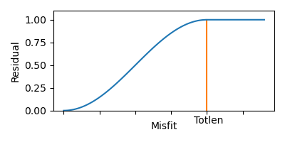
Sine taper function mapping Misfit to a range from 0 to 1.
Map Layers panel
The Map Layers panel is used to enable/disable the display of features and simulation results in the Map perspective and Wave Propagation panel. Options are listed and explained below.
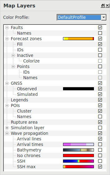
Map Layers panel
Color profile
Here you can select the active color profile or open the Gradient Profile Editor, see Color profiles, gradients and colors for more information.
The color or gradient defined for the layers in the selected color profile is displayed as a color bar next to the layer name. By clicking on this bar the Color Gradient Profile Editor opens with the active profile and the clicked layer selected.
Faults
Show/hide faults used for automatic patch generation on map, turn on labels.
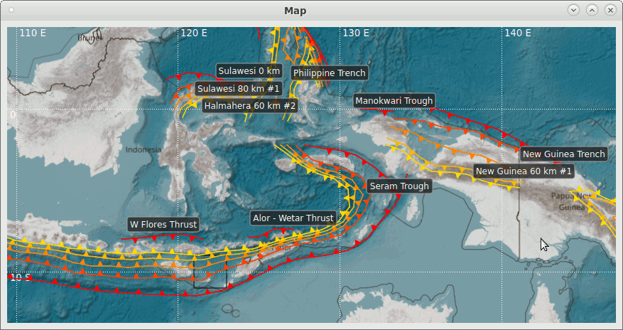
Map perspective with activated Faults feature
Faults are shown as colored lines with triangles indicating the direction of subduction. The color corresponds to depth and follows the same scheme as the bna-files in SeisComP (which are shown as thin lines without triangles if present in ~/.seiscomp/bna).
TOAST is delivered with an extensive set of preconfigured faults covering most subduction zones. See Fault geometry configuration on how to set up additional faults.
Forecast zones
Show/hide forecast zones on map. If simulations are active, the color of the forecast zones corresponds to the computed warning level.
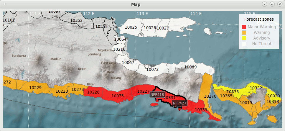
Map perspective with activated Forecast zones feature
Fill: Fill color corresponds to warning level.
IDs: Turn on zone IDs.
Inactive: Do show zones without simulation results in black outline.
Colorize: Do colorize inactive zones with lowest warning level color instead of no color.
Points: Show POI belonging to forecast zone.
IDs: Show POI IDs.
Names: Show POI names.
Forecast zones can be selected in Map view by clicking. Only then corresponding points are shown. If switching to Forecast Zones perspective, the same zone is selected.
Displacements
Show/hide coseismic displacement vectors.
Observed displacements can either be obtained automatically by messaging, be set manually or be imported from a file in XML format. See also: Displacements perspective and Import displacement amplitudes and create observed displacements. By default, they are rendered as black arrows. See Color profiles, gradients and colors on how to change the color.
Simulated displacements are computed by simulations. They are rendered in the color according to the active simulations.
The horizontal displacement is shown with a solid line, the vertical displacement with a dashed line and a semicircular arrow head. Depending on the displacement display settings, the length of the displacement is represented by the length of the arrows. A tooltip for the arrows shows additional information.
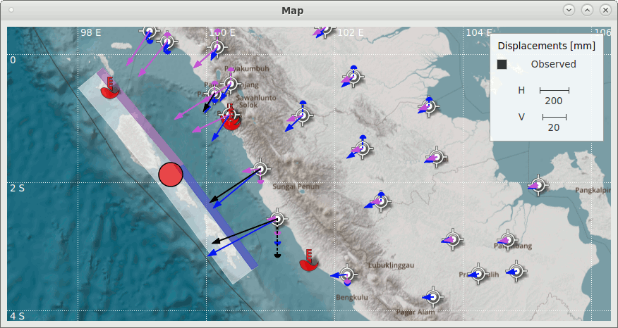
Map perspective with active Displacement feature showing two selected simulations with the same epicenter but different rupture planes
The display settings can be changed via TOAST configuration or dialog: or by right mouse click on Map view . The Min displacement threshold allows to hide arrows with a length smaller than this threshold. Additionally, the size of the arrowhead and the line width of the arrow can be set. Using the Screen option, the length of the largest visible arrow is set to Max visible length and the length of all other arrows in relation to it. When using the Zoom option, the arrow length is scaled with the Scaling factor and changes according to the zoom level of the map. The Independent vertical scaling option enables separate scaling for the vertical displacement arrows.
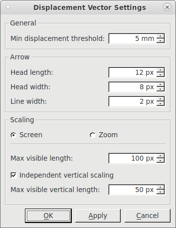
Displacement Vector Settings dialog
Note
The settings of the dialog are stored in the TOAST configuration in @CONFIGDIR@/toast.cfg (and not in @SYSTEMCONFIGDIR@/toast.cfg).
Legends
Show/hide legends. Note that only legends corresponding to features which are selected in the Map Layers panel are shown. Following image shows all possible legends.
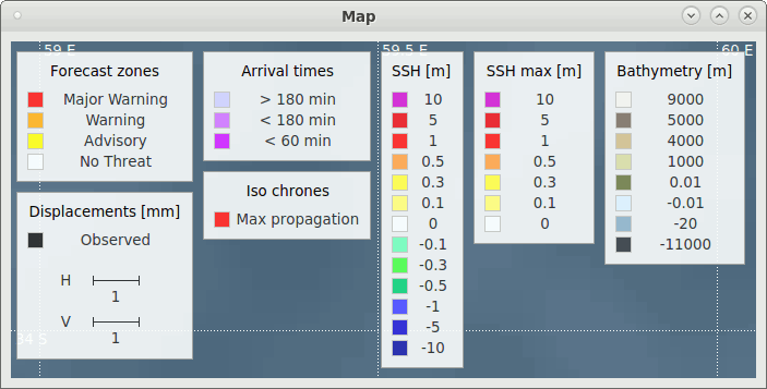
Legends in Map perspective
POIs
Show/hide tide gauge positions on map, turn on their station codes.
Map perspective with activated POIs feature
If simulations are active, the coloring of the tide gauge corresponds to the highest maximum wave height of the active simulations at that location.
If Cluster is selected, nearby stations are grouped and shown as a circled number, the color is according to the highest value in the group. Grouping is dynamically adjusted depending on zoom level.
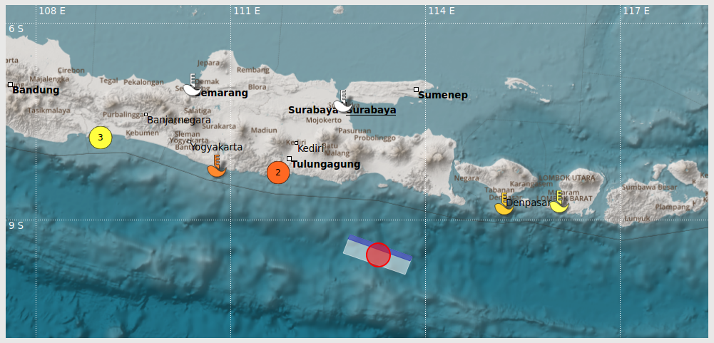
Rupture area
Show/hide the Rupture area of the active simulations.
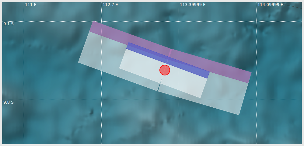
Map perspective with activated Rupture area feature
This option enables the display of the patches which were used for the simulations. The colored bar indicates the deeper side of the patch, the color corresponds to the simulation color.
Simulation layer
Show/Hide simulation layers.
Simulation layers show additional information for the available simulations (e.g. the location of precomputed TsunAWI simulations). If no simulation layer is available, this option is hidden.
Wave propagation
Show/hide wave propagation layer for active simulations in the Map perspective and Wave Propagation panel.
Use the Simulation player to select a time for isochrones and ssh. See also: Display simulation results.
Wave Propagation panel
This panel shows numerical values for the active simulations for those features which are selected in the Map Layers panel. Move the mouse in the Map perspective to get values at different locations. If several simulations are active, then the worst-case value is shown (maximum for wave heights, minimum for arrival times).
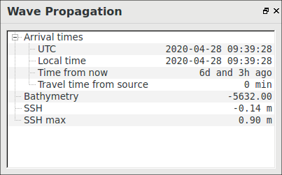
Wave Propagation panel
Color profiles, gradients and colors
Each profile consists of different types that define the colors or gradients of map-related features like Forecast zones warning levels or SSH max. The current active profile is shown in the Map Layers Panel, for more informations see Color Profile in Map Layers Panel.
Create and modify color profiles
By default, all simulation related results are color coded according to the DefaultProfile. This profile can not be changed, but new profiles can be added using the Color Gradient Profile Editor. To launch it, select Configure… in the the Color profile drop-down menu of the Map Layers Panel. Alternatively you can click on one of the color bars there or use .
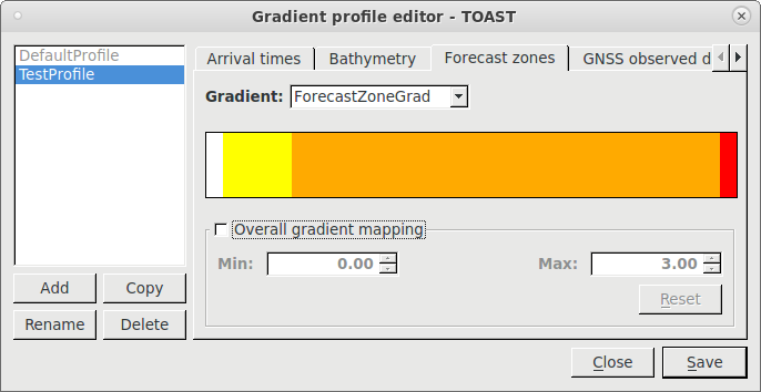
Color Gradient Profile Editor
First, add a color profile by clicking on New or Copy. New creates a new color profile based on the default profile, while Copy copies the selected profile. Then select the tab of the feature you want to edit. Next select the color or gradient you want to use for the feature in the drop-down menu. If the existing colors or gradients do not match your desired settings, you can change them using the Color Gradients Editor. To launch it, you can click on the colored bar representing the color or gradient.
The minimum and maximum values below the color bar are by default set to the minimum and maximum values defined in the selected color gradient. You can override them by selecting Overall gradient mapping, in which case the whole gradient is linearly mapped to the range of these values. This is useful if a quick change is necessary.
Click Save, to save the color profiles. Now you have a new color gradient profile which can be selected in the Map Layers panel.
The color profiles are stored in the file /home/sysop/seiscomp/share/toast/mapstyles, see also Color profiles, gradients and colors configuration.
Note
Overall gradient mapping is deactivated for default profile features or when a color is selected.
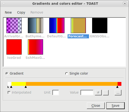
Create and modify colors and gradients
The Color Gradients Editor is a tool for creating, changing and removing colors and gradients. To launch it, click the color bar in the Color Gradient Profile Editor or select .
Color Gradients Editor
Add a new gradient or color by clicking on New or Copy or by right mouse click on one of the present gradients and using the context menu actions. New creates a empty color or gradient based on your last selection, while Copy creates a copy of the current selected item. Select a gradient or a color from the list to edit it.
Note
Gradients and colors assigned in the default profile or assigned to multiple profiles are immutable. You can see the corresponding profiles by hovering over the gradient or color item in the list.
In Gradient mode you can edit gradients. The gradient thresholds are shown as black arrows below the color bar. Select a threshold to edit the corresponding value, color and label. Add new thresholds with double click or right mouse click on the color bar. By right mouse click on an arrow, you can remove it. Select Interpolated for a continuous gradient or change the Unit. The value of the currently selected threshold can be changed with the Value edit or by sliding the threshold arrow underneath the color bar. The color of the currently selected threshold can be set by clicking the colored square icon. Note that transparency is defined using the Alpha value: 0 means transparent and 255 means opaque. The # opens a dialog for changing the label. The … icon opens the Color Table Editor for editing values (Key column), colors (Color) and labels (Tag).
Select Single color to edit a gradient containing only one color. In this mode you can select the color by clicking on the color bar. Add or change the tag and the unit of the color. Currently only Displacements - Observed and Iso chrones use Single color mode.
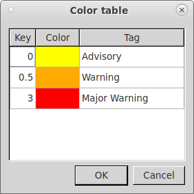
Color Table Editor
Click Save, to save the colors and gradients. Now, they are available in the color profile editor.
The gradients and colors, like the profiles, are also stored in the file /home/sysop/seiscomp/share/toast/mapstyles, see also Color profiles, gradients and colors configuration.
Task Manager
The task manager lists all processes started by TOAST. Processes can be killed using right mouse click. The task manager is opened using or by clicking the gear icon on the right of the status bar. The first number in the icon shows the number of running, the second of pending processes.
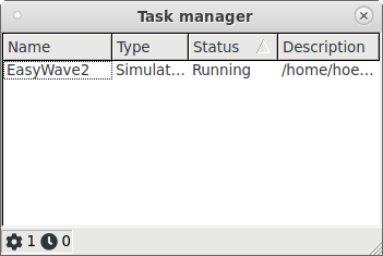
Task manager
System Log
In order to display the system logging output, click the Show system log button in the status bar on the lower right of the TOAST window or via . Use the buttons on top for filtering.
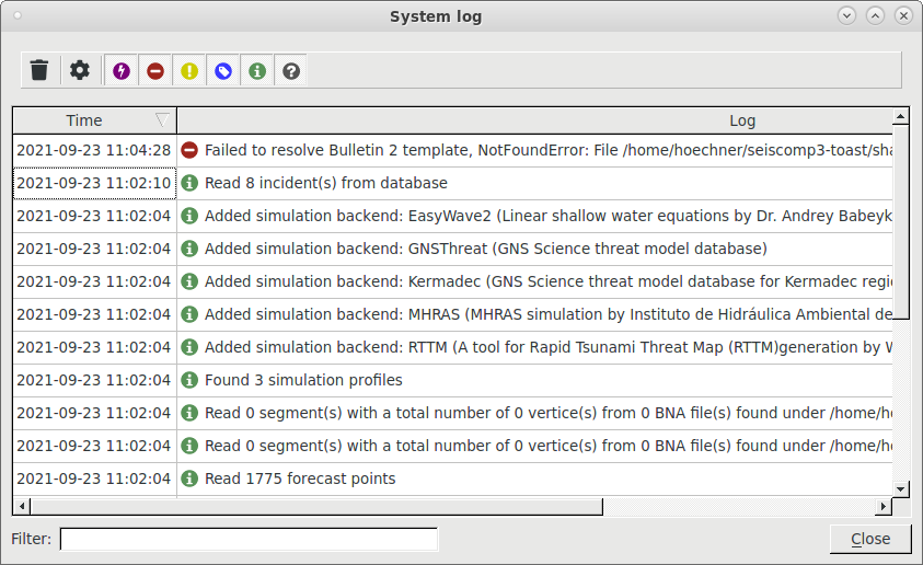
System log
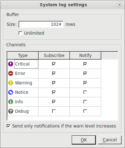
Use the settings icon to select which channels should be received and notified (latter in form of an icon in the status bar). Note that the selectable option on the bottom: Send only notifications if the warn level increases is related to system channel type and has nothing to do with tsunami warning levels.
System log settings
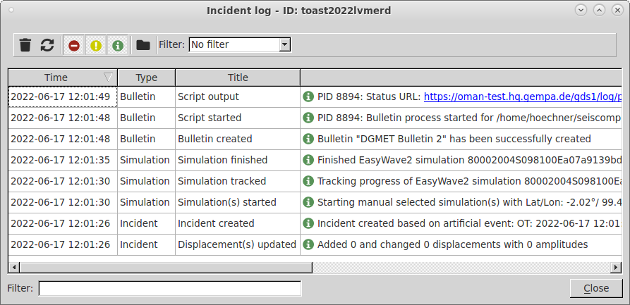
Incident Log
The incident log contains information starting from incident creation to execution of simulations, manual setting of threat levels and picks or dissemination of bulletins. The log viewer can be opened via , with the shortcut CTRL+I or by clicking the Show incident log button in the database panel in Simulations mode. It always shows the logs for the currently selected incident.
The logs for each incident are stored in a text file:
@CONFIGDIR@/log/toast-incidents/YYYY/MM/eventID.log, where the date
refers to creation time (not origin time).
The log files can be opened directly using the context menu on an incident in
the database panel in Incidents mode.
Note that these files are never deleted by TOAST, even if an incident is
removed.
Incident log